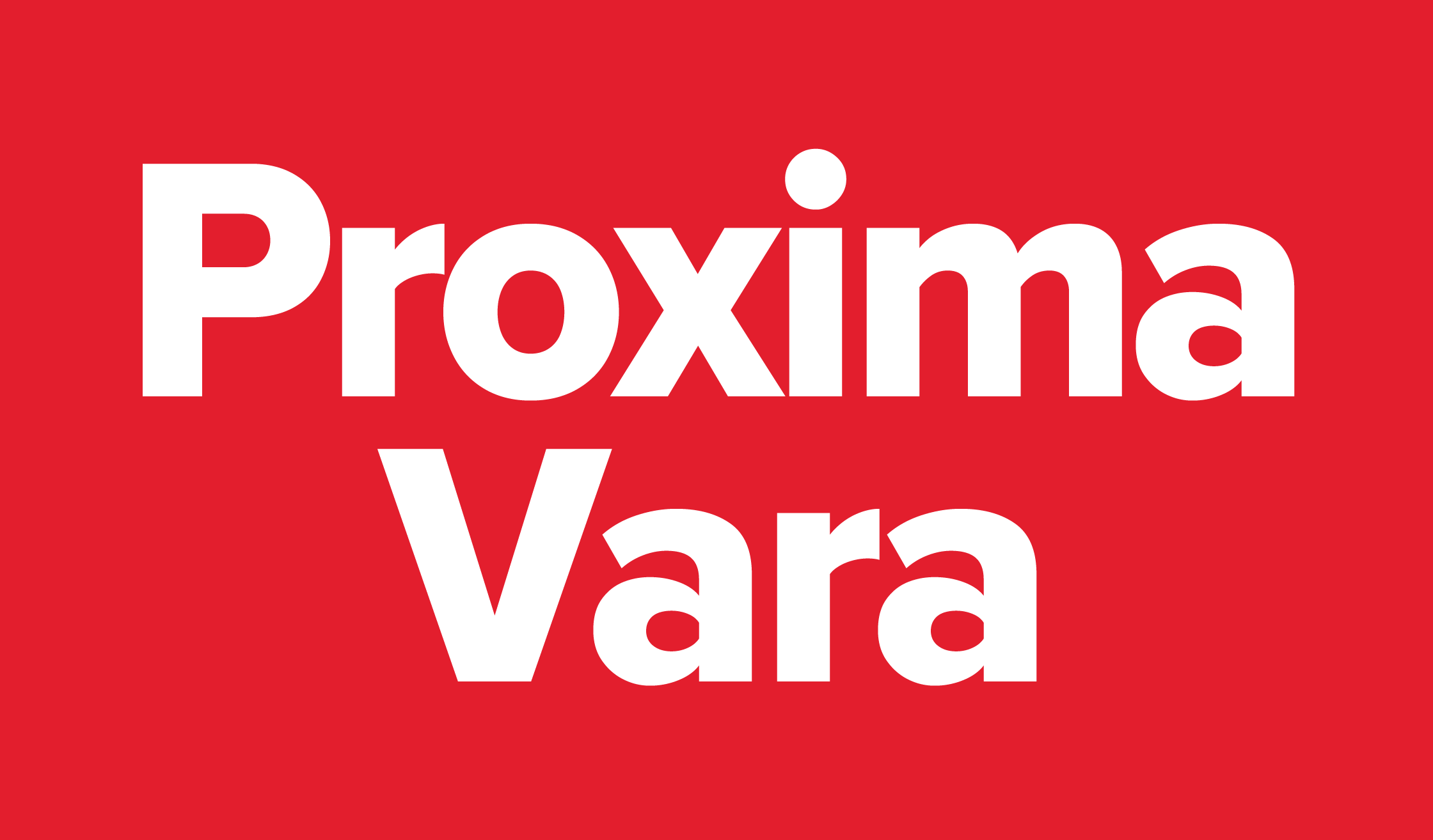

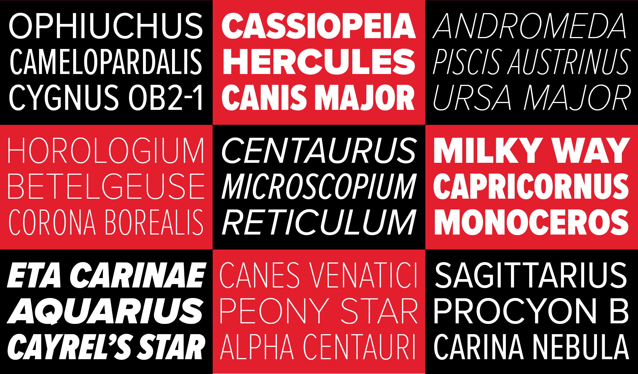


(Re)introducing Skin & Bones
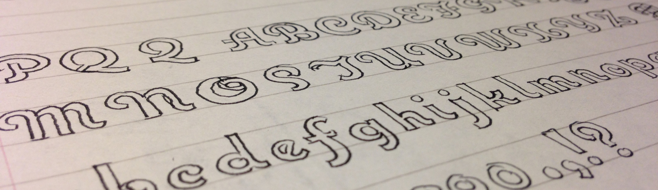
Date. Skin & Bones is an unusual font release for me. It’s not only a revival, it’s a designer-authorized revival. It was originally designed by Douglas F. Jones and released as a 2” film font in 1972 by VGC (Visual Graphics Corporation, now defunct)….